This blog was published on June 20, 2022.
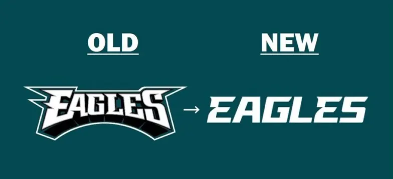
The Philadelphia Eagles recently revealed its new wordmark, and there’s nothing “Philly Special” about it. As a life-long Eagles fan, I would say I’m fairly comfortable with change – we frequently change our coaches and quarterbacks – but the one thing you don’t mess with is the brand.
The old Eagles wordmark had character, just like its fans. But the new one is so minimal that it looks like they just picked a font and typed it out in a word document.
It’s usually “fly Eagles fly,” but when I saw the new wordmark logo, all I could think was why Eagles why?

As a communications professional, I actually do know why. Brands across all industries are opting for a more minimalist design style in logos and creative assets. Clean and decluttered designs are synonymous with sophistication – something most organizations strive to be. Minimalist design can also make what a company does ambiguous. This allows companies to add revenue streams beyond their original business plans and even expand into other industries. This runs counter to the former fad of using high descriptive designed logos that tell consumers exactly what you do. For the Eagles, this logo feels like fixing something that wasn’t broken. And the fans are not happy.
I’m not saying that all rebrands are bad. Rebranding can benefit company cultures, consumer perceptions and bottom lines.
The D+P team has been supporting organizations with new branding, messaging, strategic communications plans and much more for nearly 20 years. In our experience, here are a few key considerations to keep in mind when thinking about rebranding.
Discover your why
While the prospect of a new logo design or a new color scheme can be enticing, it’s important to figure out just why you want to change and what you hope to get out of it before hiring a graphic designer.
Without a deep understanding of your “why,” an abrupt change could unintentionally harm your brand’s reputation. A loyal customer base is something to treasure, and a shakeup in name or design could result in decreased brand recognition leading to losses in critical areas like awareness, utilization and revenue.
Find your fit
Every organization has peers and competitors. When ideating new names and logos, auditing your competitive landscape is an important early step. What messages do brand names among your peer set convey? What do their logos or marks communicate visually? When studying color palettes of peer branding, are their patterns or trends?
An audit will help you figure out where your brand fits into the mix, but more importantly, how it can stand out from the crowd.
Visualize your brand
The visual identity of a brand is crucial. On the design side, logos, font and color combinations all play a role in what an audience thinks and feels about your organization, and these elements are important for more than just marketing purposes.
Case in point, web and online experiences for consumers should be accessible for all, including those who are blind and low vision who may be using screen readers to navigate through your content. Considerations like high-contrast colors, carefully selected type fonts, and deliberate alt text for web images were central to the design of its rebranded logo, website, and newsletters.
Plan your roll out
Before going public, you’ll want to articulate the messaging that is driving the change and what that change means for employees, consumers and stakeholders. Next, plan the rollout and the methods and means of delivering the news and sharing your new brand with each audience. You only get one chance at the new introduction, so it’s critical to decide the best way to reach your key audiences, while anticipating their possible responses.
When determining the cadence or flow of your roll-out communications, internal audiences such as employees and board members should top the list. You’ll want to make sure that you aren’t surprising those invested in your success. Support from employees help make the transition smooth.
If you think your brand could use a fresh start, drop us a line at resteasy@devinepartners.com to see how we can help with your transformation.
Devine + Partners is a public relations agency based in Philadelphia. We offer a full range of communications services – from message and content development and media relations to issues management and employee and community engagement.


